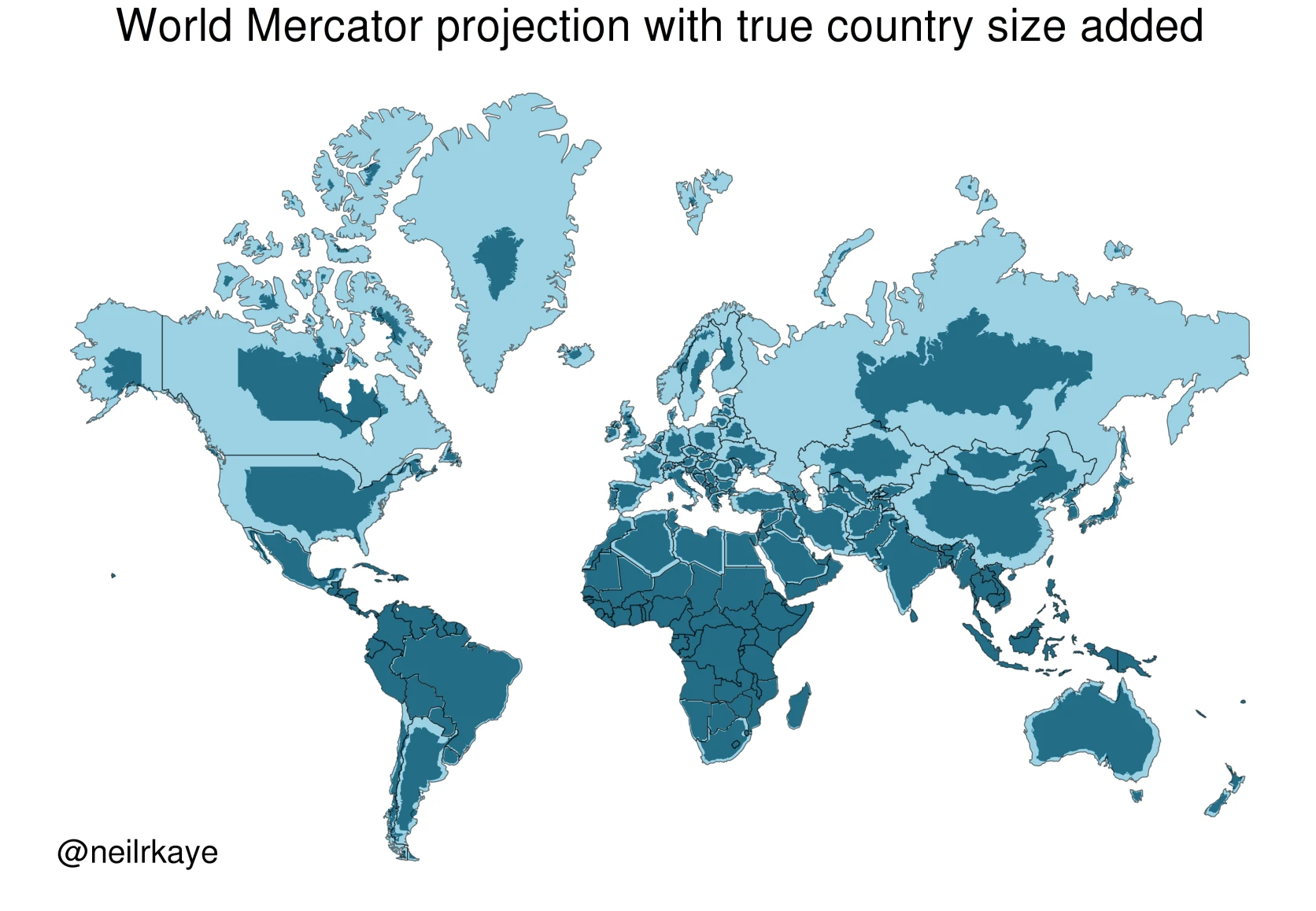
Brilliant Maps’ New True Size Comparison Tool compares Mercator outlines with equal-area outlines. Because the official tool cannot be embedded reliably, Googolstars built a native in-page version around the same core comparison and links clearly to the original.
Key points
- The Mercator projection preserves local angles and directions, but area distortion increases with latitude; high-latitude regions are generally enlarged.
- Countries do not actually shrink in the equal-area outlines. They return to a scale at which areas can be compared, and the distortion affects both hemispheres.
- The native New True Size Comparison Tool overlays both outlines and reports true area, apparent area, inflation factor and centroid latitude without loading a third-party iframe.
On the familiar Mercator world map, Greenland, Canada and Russia occupy vast areas of the frame. Put the same countries on an equal-area scale and they become markedly smaller. Their land area has not changed: the Mercator projection progressively enlarges places farther from the equator. Brilliant Maps turned that discrepancy into an interactive comparison with its New True Size Comparison Tool. Because the official tool cannot be embedded reliably here, Googolstars built a native in-page version around the same core comparison and retains a clear link to the original tool.
Why do high-latitude countries look so large?
The Mercator projection unfolds a globe onto a plane while preserving local angles and compass bearings. To retain that property, meridians remain parallel and the spacing between parallels increases toward the poles. Both horizontal and vertical scales are stretched, so area grows rapidly.
Using the local scale of a spherical Mercator projection, area inflation is almost zero near the equator. At latitude 45°, area is about 2 times the true value; at 60°, about 4 times; and at 75°, nearly 15 times. Countries normally span several latitudes, so the tool calculates the overall factor from the complete boundary geometry rather than substituting the centroid latitude.
“Smaller” means returning to the true proportion
When the solid equal-area outline is smaller than the dashed Mercator outline, the map had enlarged that country; the equal-area projection has not removed any territory. Countries near the equator change little, while high-latitude countries contract much more. Distortion depends on distance from the equator, so high southern latitudes are affected too. Familiar examples tend to be northern because most large land masses lie in the Northern Hemisphere.
Take Greenland, the tool’s default example. From the simplified boundary, its equal-area outline measures about 2,190,208 km², while its apparent Mercator area is about 36,204,819 km²—a factor of 16.53. That explains why Greenland can look comparable with Africa on a conventional world map even though Africa’s true area is roughly 14 times Greenland’s.
How does the new tool show the difference?
The interface offers single-country and two-country modes. After you choose a country, a red dashed line shows its apparent Mercator outline and a solid green shape shows its equal-area outline. Data cards below report true area, apparent Mercator area, the overall inflation factor and centroid latitude, connecting the visual difference with numbers. All outlines and values are calculated on this site without relying on an external page. The selector now contains 241 countries and territories, including all 56 options in the original Brilliant Maps tool.
Try the New True Size Comparison Tool
The true size of every country versus the Mercator map
Mercator stretches area more strongly farther from the equator. Choose a country to compare its apparent map outline with its equal-area outline.
Calculating projected outlines…
The tool uses public-domain Natural Earth 1:10m Admin 0 country boundaries. It calculates true area with spherical equal-area geometry and compares that with the complete country geometry after spherical Mercator projection. Geometry is simplified with a 0.02° tolerance, coordinates are rounded to 0.001°, and values are rounded. The result is suitable for understanding projection differences, not as an official boundary or land-area measurement.
The map is not wrong; it preserves different properties
No flat map can preserve direction, shape, distance and area on a sphere all at once. Mercator emphasizes local angles and directions, which makes it useful for navigation. Equal-area projections allow fair area comparisons, but make other compromises in shape or direction. The important question is not which projection is the single correct answer, but what each one preserves and what it sacrifices.